texts and words

This Thing of Paper: Design Considerations

I introduced This Thing of Paper last week. This week I am writing about the work that went into the design process and how I defined the design vocabulary. If you like reading about how designers' brains work, this post will definitely give you a glimpse into my way of working! borderhorz

Work on This Thing of Paper started some time in 2012. I began talking to friends and colleagues about this mad notion I had: I wanted to make a knitting collection by hand like a medieval scribe. The practicalities made me abandon this idea: I am a semi-competent calligrapher, but making a whole book by hand* would have taken me years. Also, pattern support would have been interesting ("Let me send you a handwritten letter about row 97") and the idea of inserting errata was daunting.

*) manuscript literally translates as something 'written by hand'!

As it happens, though, I have a background in book history and as the idea of making a book by hand left me, I began thinking about the shift from manuscript to printed book. I knew I'd have enough material to write about but I had to find out if I had design material.

Screenshot 2016-04-07 14.31-horz

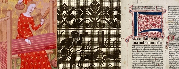
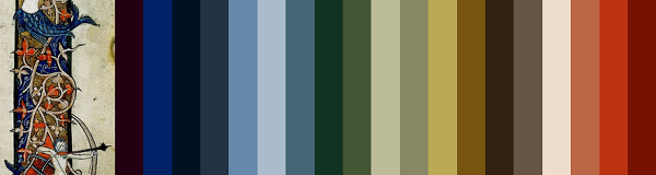
I set up a moodboard. I browsed digitalised archives of books from the period. I visited art galleries & museums (and one of my local museums was even kind enough to have a relevant exhibition!). I sketched and examined sources from 14th century Book of Hours manuscripts to 16th century embroidery manuals.

Keywords emerged as did a distinct colour palette and design vocabulary.

The colour palette was fairly easy to conceptualise: parchment and paper with ink and decoration. Soft natural shades with rich, deep mineral-derived pigments. Below you can see some fairly typical details from 14th century illuminated manuscripts and how they translate into colour palettes. Contrary to what many people believe, though, most manuscripts were not highly decorated. As time progressed, technology allowed for woodcuts to be inserted into printed pages - some were tinted by hand afterwards.

colours

Related: here is an  an excellent article about why it is impossible to replicate the colours of medieval stained glass.

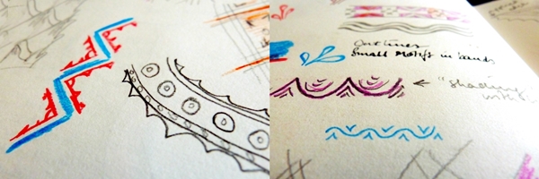
The design vocabulary was harder to capture. I had worked with such a sparse design vocabulary for Doggerland that I was overwhelmed by the visual possibilities in This Thing of Paper. Dragons! Devils! Stars! Acanthus leaves! Overwhelmed.

Instead I began to fall in love with the concept of negative space. Paper being much cheaper than vellum meant that you did not need to cram as much information as possible into a page; margins became wider and spaces between words appeared! I'll be writing much more about this in the actual book - but how things relate to one another in a confined visual space definitely became a thing for me. I also fell for small geometric motifs and how things are visually repeated in different ways.

So, the design vocabulary is much more exuberant than it ever was for Doggerland, but it does not mean I have not edited it ruthlessly. I am placing the visual cues in a 21st century context with wearability at the forefront. Less rustic garterstitch and pared-down lace; more play with colour and delicate, ornamental motifs.

borderhorz

Further design considerations: I wanted items that would appeal to a range of knitters. The projects are aimed at advanced beginner knitters to advanced knitters. Some projects will be achievable in a weekend or over a week; others will demand more involvement. The items cover texture, colour and lace. Needing to include such a variety of things in a relatively small collection meant editing what I needed to design.

P1320509-horz

For structure, I divided This Thing of Paper into three sections (or three main stories, if you like) and each section includes a garment as well as accessories. Each of the three garments will be graded across seven sizes (XS to 3X) and will have notes on how to modify fit. The accessories are a mixtures of shawls, hats and gloves. I'll be including sizing options here as well. Most patterns will be both charted and written out, because I know many people prefer to work from both (the jury's out on one shawl pattern, but I will keep you updated on that).

borderhorz

Thank you so, so much for all the enthusiasm and excitement so far. This is already a long entry but I want to tell you how much your reaction has meant to me. At the risk of sounding corny, I genuinely feel like I'm not alone on this whole This Thing of Paper journey because you are all sharing this adventure with me. I know this may sound like one of Those Inspirational Quotes I usually wince at - but I genuinely mean it. It is so nice to have you along.

Next week I will be writing about all the practical stuff (but there will still be pretty colours & images).

Ingenious Impressions at Glasgow Hunterian Art Gallery

February 2015 273 Glasgow Hunterian Museum is currently hosting an exhibition on pre-1500 printed books, known as incunabula. In my previous academic incarnation, I used to work on the transition from manuscripts to printed books, so I was obviously thrilled to see this exhibition open in a local museum.  On Thursday I was lucky enough to catch a preview before going to a workshop the very next day. It is fair to say that the workshop turned out to be some of the best and most memorable hours of my life. I cannot thank Martin Andrews and Alan May enough for their generous sharing of all their knowledge and expertise.

Not only did I get to have a go at printing a page from the famous 42-line Gutenberg Bible, but I used a replica 15th C printing press built by Alan May for BBC's Stephen Fry & The Gutenberg Press programme (I recommend this programme - it was very well researched). May used several near-contemporary etchings and woodblock prints to reconstruct the press as no printing presses from the time has survived. I was very interested in an Albrecht Dürer etching showing a modified two-pull press which Alan May described as fundamentally flawed, yet utterly precise. Dürer is a fascinating figure, anyway, and I like the idea of him having fingers in a lot of pies!

February 2015 257

Another highlight was getting to cast my own type(!) under careful supervision. May & Andrews went through the entire process of carving out a prototype (the very name!), showing us how to develop a matrix from a prototype, before starting to cast types. It was absolutely fantastic.

February 2015 292

And dare I whisper that my next big collection actually has something to do with knowledge-making in Early Modern Europe? Much more on that when the time comes, but it's a huge thrill that this exhibition has opened up in Glasgow just as the next stage of research begins.

Ingenious Impressions at  Glasgow Hunterian Art Gallery runs from February 27 until June 21, 2015. Free Admission.

Book Review: Kate Atherley's Pattern Writing for Knit Designers

atherley
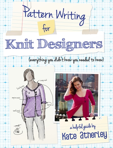
I get a lot of emails. Some deal with my own work, but a surprising amount of messages comes from people wanting to write patterns. Maybe my epic Twitter rants about poorly written patterns are to blame; maybe it is because when I teach I go on about things like gauge and chart symbols. Who knows? What do you do if you didn't fluke a background in technical writing? Up to now you had to rely upon your knowledge of others' pattern writing skills and try to imitate their way of writing instructions. I understand why people do this, but it does not allow for reflection upon your own style and you may fall into adopting other people's bad habits without realising there are other options. Or you asked people like me who does have a background in technical writing (and who is horrifically busy) or you ask in Ravelry fora with somewhat mixed results.

Anyway, it's been really frustrating for me that I have had nowhere to send all these lovely people. There are some great pattern design books in the world (like Maggie Righetti's Sweater Design in Plain English) but no pattern writing books out there. With Kate Atherley's book, Pattern Writing for Knit Designers, that drought is now at an end. It is not a knitting book filled with patterns; it is a book telling designers how to write patterns that are clear, concise and easy to follow. Kate Atherley is one of the most highly regarded technical editors in the business and her wealth of experience shows.

The book is a master-class in how to think about pattern writing. She discusses everything from how to structure a pattern (and provides a pattern template), which abbreviations to use, how to think about communicating cables and deciding upon formatting to why a designer's relationship with their technical editor is so important, working with and defining style sheets, how to self-publish, how to work with publications (and what they expect of you as a designer) and how to making easy-to-follow charts.  It is an incredibly comprehensive book.

atherley2

Kate's voice is authoritative, but never condescending. She assumes the reader is clever, resourceful and able to think for themselves. Look at the excerpt above: the three examples of a repeat within a row have an identical outcome (in terms of how many stitches you have at the end) but Kate goes through the examples one by one, and lets the reader work out why some formats are more effective than others.

And she makes you think about how writing patterns means communicating to someone who is not you. I find this is a pitfall for many designers who assume knitters work in the same way as themselves and find it hard to write for others. Writing for an audience is a real skill - and writing technical instructions for others to follow is even harder. I really like the way Kate makes you consider your audience before you begin writing.

atherley3

In short, this book is a marvel. It is a technical and dry in places (which I obviously love), but after a dense paragraph about the taxonomy of cable stitches, Kate shows why you need to wrap your head about how to classify and name cable stitches - and she does so in a wonderfully down-to-earth manner. More importantly, she makes sure you will enjoy writing that cabled hat pattern of yours. Most importantly, Kate makes sure that your cabled hat pattern will make an enjoyable knit for knitters who will talk about your well-written pattern to others and keep coming back for more. Huzzah!

I should point out (in the name of full disclosure) that I am cited in the book and that I was asked to read an early draft of this book, but that does not alter my praise of this book. Whether you are an aspiring designer or an experienced designer/tech editor, this book will instruct and help you. I keep a copy next to me on my desk as it comes in handy on a daily basis. The book is full of great advice from other designers and technical editors - and has a great deal of links to useful resources. As Kate says, the book won't help you come up with designs but it will teach you how to write great patterns people will want to make again and again.

And happy knitters make for a happy knitting world.

You can buy the book here and it costs CAD$25. A real bargain for what you'll learn.

The Kirkja Shawl

June 2012 780
June 2012 780

And then I designed a shawl and it appeared in Knit Now. Okay, things are never quite that simple. Earlier this year I was exchanging ideas with Knit Now magazine, a UK knitting magazine focused on accessories and keen on showcasing British design. The editors were doing an issue on "heritage" and when I mentioned I was part Faroese, the end result was the Kirkja shawl.

The sample is knitted in Old Maiden Aunt 100% merino 4ply in the delicious "Buttermint" colourway (it takes just one 400 yrds skein!). I knitted the sample back in late spring, but I must somehow have known I'd need a ray of sunshine in December. Isn't it just a stunning happy colour?

I opted against a traditional Faroese shape as I wanted the shawl to be an accessible knit for intermediate knitters. No shoulder shaping or casting on several hundred stitches. Instead I chose to play with geometric patterns so familiar to Faroese knitters and showcase them in an easy triangular shawl.

It was really good working with others for a change. I tend to Wear All the Hats when I design, but I had the support of the Knit Now team during the whole Kirkja design process. It was fab seeing the finished photos from the professional photo shoot and I really enjoyed the bantering back & forth about stuff that non-designers find dull (i.e. pattern formatting & charting software).

Kirkja can be found in Knit Now issue 16 which is out with subscribers now and will be in UK shops tomorrow (December 13, 2012). Not only did it make the cover, but it also came highly commended by the editors and got a four-page spread inside the magazine.

(I'd pop champagne but I think I need some tea to warm myself up instead! It is freezing outside and our flat is cold. The glamorous life of a knitting designer!)

On Education, Where Life Takes You & Knitting Patterns

Recently I was contacted by a spammer who wanted to pay me for allowing him/her to post on this site. Needless to say, I ignored them but the suggested topic about higher education did stay with me. I am currently working on translating Danish knitting pattens into English. I am working from extremely well-written and lucid knitting patterns which makes working on them an absolute joy. However, they are also written in a typical no-nonsense Scandinavian style with very minimalist instructions. The designer knows her knitters will be familiar with that style of instruction and trusts that they know what she means. The actual knitting part of this translation is very straightforward - 2r is easy to translate into k2 - but bridging the gap between two pattern traditions is the actual challenge. I want to be utterly faithful to the original pattern while also making the English version easy to understand for knitters accustomed to patterns which guide you through every step of the process.

It's a lot of fun.

I have an academic background and I often encounter people who wonder why I "wasted" eight years of my life at university when I could just have walked straight into my current freelance life. I look at it very different. I think I use my educational background every single day in everything I do.

Pattern writing? My time teaching technical writing at university taught me a lot about building structure and parsing complex information in limited space. That ability is worth its weight in gold and extends into many, many aspects of my current working life.

Translating? Listen, if you are serious about translating from one language to another, you need to understand how languages work. You also need to understand cultural and social concerns of both the original language and the target language. Your biggest challenge is to render all your hard work invisible for the target audience. Six months picking grapes in Spain will not prepare you for translating Lorca, in other words. I spent years having to learn how to tell one kind of subordinate clause from another. I am not saying I still remember them all, but I can delve into the minutiae of language as a result.

Teaching? It goes without saying that I still use all the tricks I learned whilst teaching at university and at private companies. I learned to deal with different learning styles, different skill levels, and how to make students feel confident enough to go problem-solving on their own.

Finding design inspiration? As unlikely as it sounds, I also use my education here although it was in a non-creative field. I love early 20th century culture and my two main mood boards on Pinterest reflect this. I did a lot of work on early 20th century poetry (and typography - hat tip) and these things still influence me: I attempt to pare things down and reduce design elements. I think about why I want certain designs to look a particular way and I try to maintain a certain structure throughout key designs. Maybe if I had gone to art school I would approach designing differently? More organically?

I was lucky. I went to university in the mid-90s and early-00s. I did not have to pay tuition fees and I was at liberty to pursue niche interests at great length (as weird as it sounds, specialising in modernist print culture doesn't make you hugely appealing to the private sector. Who knew?). I did not have to get a part-time job as the Danish state funded me and I have no student debts now. Needless to say, those days have gone and young people are facing uncertain futures.

My message is, though: education is never wasted. You may not end up doing anything that has anything obvious to do with your degree but if you are serious about your studies, you will end up with a set of skills that'll last you your entire life. No matter where it takes you.

Arboretum

Visual poetry: a poetry form in which the shape of the poem is as important as the words themselves. The Scottish poet and gardener Ian Hamilton Smith combined gardening, sculptures and poetry to great effect. The woods around Bennachie yield beautiful surprises as you walk around in them:  words carved in stone, sentences arranged amongst branches and trunks.  I live far from Bennachie, but I live very close to The Glasgow Arboretum (you can almost see my home in the photo) where you can also find fragments of poetry scattered among the trees. My winter mitts? A fairly quick, uncomplicated knit. I used a pattern I found in The Knitting Book and yarn given to me by my mother. I have tiny hands, so went down a few needle sizes and I also added thumbs. The yarn matches a cowl and a hat I made earlier, so I'm all set for winter now. Bring it on.

I am spending today swatching for a future project/design. I played around with charts in Excel earlier and now I'm trying to figure out which texture I like best. It is always fun trying to strike a balance between my personal aesthetics, an imagined level of difficulty, and the actual purpose of the pattern.

I had a quick Twitter exchange with a few people after I came up with a true lace chart (i.e. lace knitted on both sides). I loved the idea of the pattern, but when I started to work it up in 4ply I knew it did not work in such a relatively heavy yarn. Twitterati consensus was that true lace is scary. I don't think this is necessarily true, but I know that this is what many people feel. Honestly, this project is not one for 'scary' lace so that chart was shelved alongside many other charts. Hopefully I will find the right project for it at some point.

Meanwhile I have come up with another chart - or, rather, four different versions of the same chart. I am busy swatching trying to figure out which version works best. I'm using some leftover Old Maiden Aunt merino/silk for the swatches. I need more of this yarn, I really do. It's beautiful to work with on my new Addi bamboo needles.

Finally, the soundtrack for work: I rediscovered this album this morning. The light is pale and thin. Like you. Has it really been 19 years?