Purls

An Autumnal Pattern Launch: the Burnet Hat

b3 
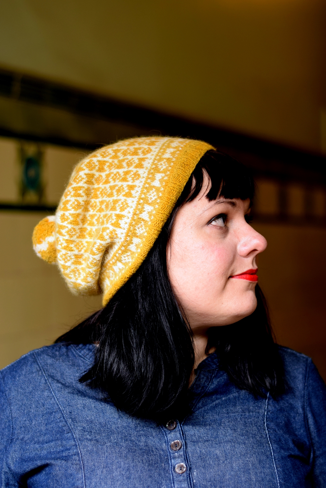
Judging by my inbox, this pattern launch should please a lot of people out there! Say hello to the Burnet hat! This was an Edinburgh Yarn Festival 2016 exclusive pattern, but the copyright has now reverted to me. Burnet is one of my own personal favourite patterns and I am so happy that so many of you agree with me!

You can buy Burnet via Ravelry and Loveknitting (where you can also peruse the Shilasdair yarn!).

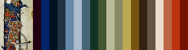
I was asked by the EYF folks to design a hat inspired by the tenement tiles I document across Glasgow.

Glasgow's weather is notoriously 'dreich' – a Scots word meaning 'dreary' and 'bleak' - but the city is so beautiful. Its Victorian heritage is apparent in everything from wrought iron fences to elaborate street lamps. The sandstone tenements (apartment blocks) light up the cityscape with their warm glow.

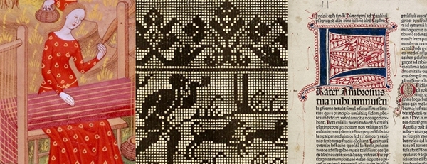
The tenements were originally an attempt to fight the widespread slum then found throughout Glasgow. The city had begun as a small, rural settlement but had grown into an industrial hotspot. The rapid industrialisation was fuelled by shipping and manufacturing – but housing had not kept up with the boom. Architects began erecting tenements and these buildings were vast improvements upon the squalor found throughout 19th century Glasgow. The entry ways - the so-called closes - were communal spaces where people would meet, children would play, and deals would have been struck. It was important that these entryways would be easy to maintain - and this is where the beautiful tiles come in. When I was approached to design 'something Glaswegian', I only had to step outside my front door for inspiration.

b1

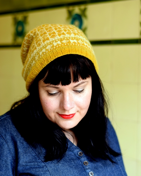
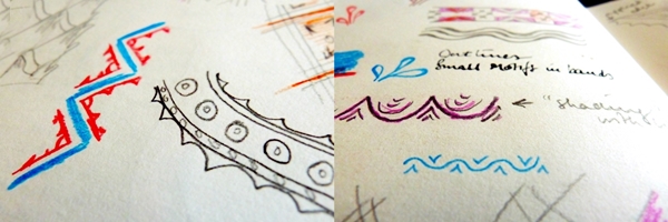
David shot the photos in Partick, Glasgow. I loved the tiles in this entryway and they were in great condition - something which can not always be said for all tenement tiles! I love the stylised, geometric feel of the tenement tiles and I think Burnet really captures that. When I was designing the pattern, I also had the wonderful geometric nature of traditional Sanquhar knitting in mind. While Burnet is not anything like traditional Sanquhar knitting, I think it's important to acknowledge this debt (this sensibility) to past generations of Scottish knitters.

b5 
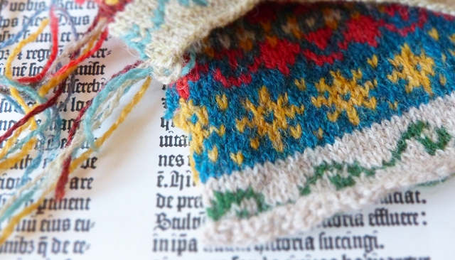
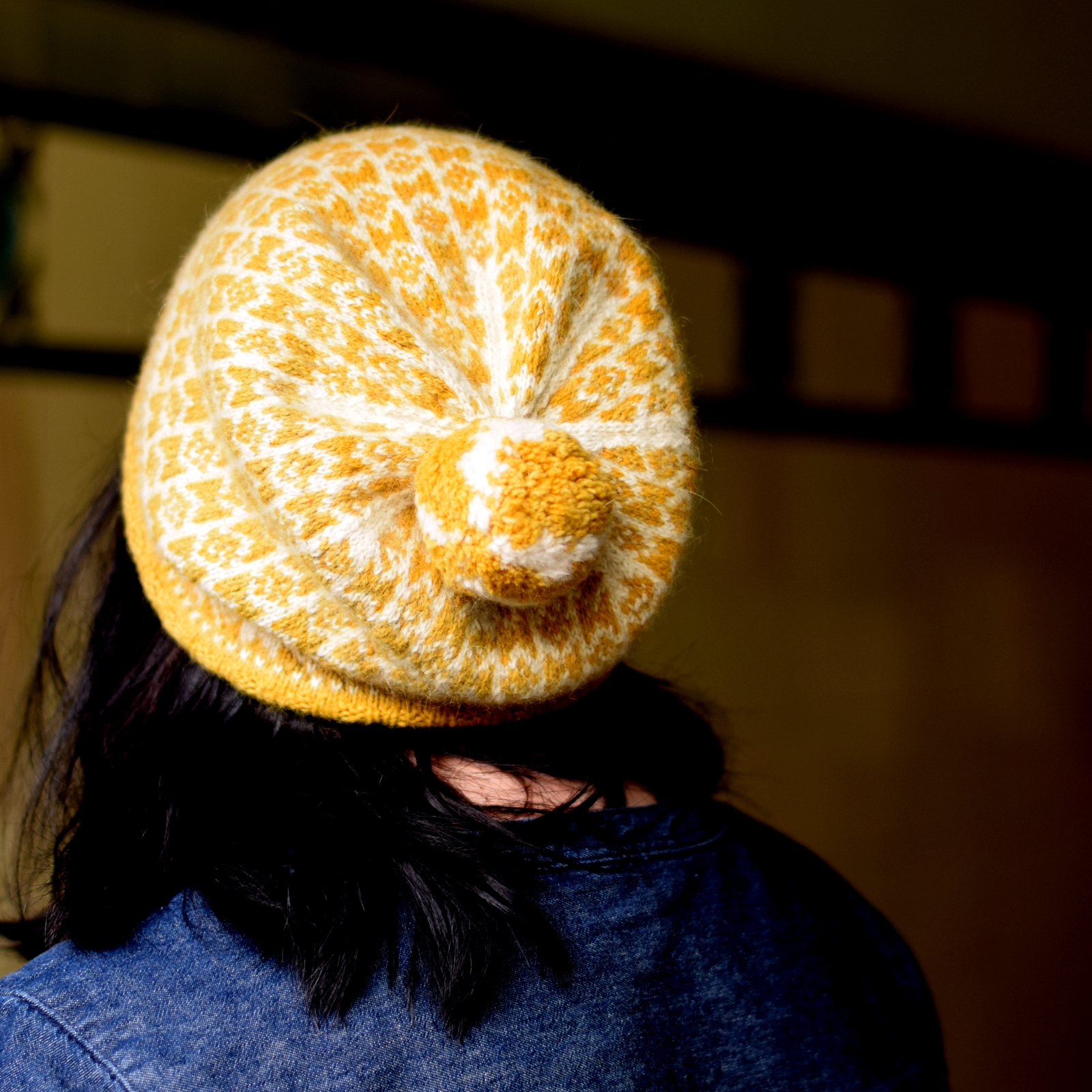
Burnet is knitted using two hanks of the exquisite Shilasdair Luxury 4ply which is plant-dyed on the Isle of Skye. The sample is knitted using the natural/undyed shade and the gorgeous Tansy Gold. Judith of Shilasdair is a big believer in dyeing yarns that reflect her natural environment on Skye - but she also knows Glasgow tenements with their tiles very well. In fact, she used to visit family living in my very own close! I greatly enjoyed collaborating with her on this project and I urge you to seek out her yarns. They are beautiful.

This past week I have been away on a research trip for my book. I will write more about my trip later but suffice to say that I was happy I had Burnet tucked into my bag. Autumn is very much here. I hope you'll enjoy knitting the pattern.

PS. If you have a copy of Wool Tribe where this pattern was first published, I have a tiny piece of errata addressing Chart A.

Review: Painted Woolly Toppers For Kids

If you asked me which designers I really admire and why, Woolly Wormhead would be one of the first names out of my mouth. There are many things to admire: the well-defined aesthetic, the technical know-how, the way she photographs her work, and the fact that Woolly runs a sustainable and ethical business. For me, personally, I also admire the playfulness and sheer fun she brings to her knitting designs. Knitting can feel so very serious at times with stone-faced models in crumpled linen dresses glaring across a misty forest lake whilst wielding an Estonian lace shawl made from unicorn yarn. Now look at this photo and don't tell me it doesn't bring a smile to your face.

aranivymae-lr

If this photo doesn't appeal to your sense of mischief, Woolly's work probably isn't for you. But you're missing out on a lot of fun knits!

Painted Woolly Toppers for Kids follows on from Woolly's 2015 book, Painted Woolly Toppers. Like its parent (huh-huh), the new book explores how to use handpainted yarns in ways that show them at their best. Woolly has designed 10 Hats for kids - and all Hats carry stonking appeal both for the knitters and the kids.

chesser-lr-1

Chesser (photo above) is one of my favourites. It is knitted in Skein Queen Crush DK (other dyers in the book include Countess Ablaze, OMA, Ripples Crafts, Five Moons, and Yarns From The Plain).

Look at the construction: sideways, up the way, small bits adding decoration. It is a Hat pattern that showcases the colours of the yarn without being overwhelmed by them. And the construction keeps the knitting interesting (yet never difficult).

Now look at this from a kid's vantage point. Does this look like yet another dull Hat your mum tells you to wear because it's cold? NOPE. It's an exploding rocket ship! It's a crown! It's an alien fruit! It's a chicken's bum! It's an astronaut's helmet! It's AWESOME!

I may be projecting a bit here (I would totally have wanted this Hat as a kid), but I love the combination of knitterly interest and hat mischief.

And Chesser isn't the only Hat that has that combination - all of them do  - and that is what I admire so much about Woolly's work.

I learn so much from Woolly's patterns - whether it is a new way of approaching short rows or a different take on how to construct a Hat - and I often find myself wishing I could knit every one of her hats just to find out how did she do that? But I am also reminded that knitting should be fun and fill me with joy. I look at the kids having fun in front of the camera wearing awesome Hats and I want to knit every one of them for the kids in my extended family.

And that, dear readers, is a sign of a jolly good knitting book.

mobberley-hr-3

Full disclosure: I received a preview copy of Painted Woolly Toppers for Kids. I have done karaoke with Woolly, we share a birthday, and I know that she would want me to share my honest opinion. So, here you go: the book is great fun and it rocks.

The book is launching later this month and will retail at £10 (PDF) or £16.99 (printed). Just in time for you to make some awesome Hats for Christmas (and use up some of those single skeins I know you have in your stash). Sign up to Woolly's newsletter or follow her on Twitter/IG for more news regarding the launch.

(All photos used here are  © Woolly Wormhead 2016)

This Thing of Paper: Design Considerations

I introduced This Thing of Paper last week. This week I am writing about the work that went into the design process and how I defined the design vocabulary. If you like reading about how designers' brains work, this post will definitely give you a glimpse into my way of working! borderhorz

Work on This Thing of Paper started some time in 2012. I began talking to friends and colleagues about this mad notion I had: I wanted to make a knitting collection by hand like a medieval scribe. The practicalities made me abandon this idea: I am a semi-competent calligrapher, but making a whole book by hand* would have taken me years. Also, pattern support would have been interesting ("Let me send you a handwritten letter about row 97") and the idea of inserting errata was daunting.

*) manuscript literally translates as something 'written by hand'!

As it happens, though, I have a background in book history and as the idea of making a book by hand left me, I began thinking about the shift from manuscript to printed book. I knew I'd have enough material to write about but I had to find out if I had design material.

Screenshot 2016-04-07 14.31-horz

I set up a moodboard. I browsed digitalised archives of books from the period. I visited art galleries & museums (and one of my local museums was even kind enough to have a relevant exhibition!). I sketched and examined sources from 14th century Book of Hours manuscripts to 16th century embroidery manuals.

Keywords emerged as did a distinct colour palette and design vocabulary.

The colour palette was fairly easy to conceptualise: parchment and paper with ink and decoration. Soft natural shades with rich, deep mineral-derived pigments. Below you can see some fairly typical details from 14th century illuminated manuscripts and how they translate into colour palettes. Contrary to what many people believe, though, most manuscripts were not highly decorated. As time progressed, technology allowed for woodcuts to be inserted into printed pages - some were tinted by hand afterwards.

colours

Related: here is an  an excellent article about why it is impossible to replicate the colours of medieval stained glass.

The design vocabulary was harder to capture. I had worked with such a sparse design vocabulary for Doggerland that I was overwhelmed by the visual possibilities in This Thing of Paper. Dragons! Devils! Stars! Acanthus leaves! Overwhelmed.

Instead I began to fall in love with the concept of negative space. Paper being much cheaper than vellum meant that you did not need to cram as much information as possible into a page; margins became wider and spaces between words appeared! I'll be writing much more about this in the actual book - but how things relate to one another in a confined visual space definitely became a thing for me. I also fell for small geometric motifs and how things are visually repeated in different ways.

So, the design vocabulary is much more exuberant than it ever was for Doggerland, but it does not mean I have not edited it ruthlessly. I am placing the visual cues in a 21st century context with wearability at the forefront. Less rustic garterstitch and pared-down lace; more play with colour and delicate, ornamental motifs.

borderhorz

Further design considerations: I wanted items that would appeal to a range of knitters. The projects are aimed at advanced beginner knitters to advanced knitters. Some projects will be achievable in a weekend or over a week; others will demand more involvement. The items cover texture, colour and lace. Needing to include such a variety of things in a relatively small collection meant editing what I needed to design.

P1320509-horz

For structure, I divided This Thing of Paper into three sections (or three main stories, if you like) and each section includes a garment as well as accessories. Each of the three garments will be graded across seven sizes (XS to 3X) and will have notes on how to modify fit. The accessories are a mixtures of shawls, hats and gloves. I'll be including sizing options here as well. Most patterns will be both charted and written out, because I know many people prefer to work from both (the jury's out on one shawl pattern, but I will keep you updated on that).

borderhorz

Thank you so, so much for all the enthusiasm and excitement so far. This is already a long entry but I want to tell you how much your reaction has meant to me. At the risk of sounding corny, I genuinely feel like I'm not alone on this whole This Thing of Paper journey because you are all sharing this adventure with me. I know this may sound like one of Those Inspirational Quotes I usually wince at - but I genuinely mean it. It is so nice to have you along.

Next week I will be writing about all the practical stuff (but there will still be pretty colours & images).

Introducing This Thing of Paper

P1320207aaa It is time to announce a project that has been a long time coming.  It is a project dear to my heart and one that I hope you will love as much as I do.

May I introduce you to This Thing of Paper? As both a knitter and a bibliophile, I have been yearning to do a project that combines my two loves. So many of you have been asking for a physical book, and I'm afraid I really took that concept and ran with it. On May 23, 2016 I will launch a Kickstarter for the publication of the book. I have chosen to do this as I want to produce a book that is as beautiful to hold and read as the patterns themselves will be to knit and wear.

This Thing of Paper is a a book of ten knitting projects with accompanying essays. The project is inspired by the age of Johan Gutenberg and his invention of the printing press. Gutenberg's work meant that books changed from being rare objects reserved for the elite to something that ordinary folk could access. I have always been fascinated by how one invention could change the course of history.

But there is more to this story.

I have been working with primary sources ranging from 14th century illuminated manuscripts to 16th century embroidery manuals. I have cast my own type* and printed a facsimile page of Gutenberg's 42-line bible on a replica 15th century printing press (once used by Stephen Fry, no less!). This Thing of Paper is steeped in one woman's love of vellum, marginalia, woodcuts and rubrication.

*(which won't be used in the book, though. I'm not inflicting pre-1500 typefaces on you!)

And I am doing all of this firmly focused on knitting.

Knitting and books share several characteristics and I particularly love the materiality of them both. Yarn flows through my fingers - and some yarns just feel right in my hands which means I keep returning to them. Books give me that feeling too. Some books are perennial favourites simply because they rest in my hands just so. One recurrent theme throughout This Thing of Paper will be the materiality of things and how we interact with those - just like inhabiting physical and imaginary landscapes was a core part of my Doggerland collection.

As for the knitting patterns, they will not be replica 15th century fashion. All the patterns inside This Thing of Paper are parts of a book, both figuratively and literally. In reality this means three garments (in seven sizes because that is how I roll) and seven accessories. I will later share a Pinterest board, so you can see exactly what inspired me. The patterns are contemporary and come in a range of difficulties.

Oh, and why This Thing of Paper? The title is taken from a 15th century treatise raging against the terrible, terrible modernity of the printing press called De laude scriptorum (In Praise of Scribes - I've read this treatise, so you don't have to). The full quote reads:

Who is ignorant of the difference between writing [scriptura] and printing [impressura]? A manuscript, written on parchment, can last a thousand years. How long will print, this thing of paper [res papirea] last?

I just couldn't resist.

Stay tuned for more blog posts about the designs, the Kickstarter details (there are some truly ace rewards) and I even have a blog tour lined up with some really amazing, talented people.

A Quick Word About Life & Knitting

recent Recently I have been a bit busy and fallen behind on, well, everything. I'll reveal everything later this week but we are still in the process of getting things right behind the scenes.

In the meantime, I thought I'd share an interview I did with Scottish mental health advocates, Mind Waves. I am a strong believer in the restorative powers of knitting. I am also hugely grateful for all the love and support we share in our knitting community. If you are a regular reader, you will know that rediscovering knitting helped me through some rough patches in my life - and I know I am not the only one. Many of you have been kind and generous enough to share stories about your life with me. Thank you.

Knitting is kind and generous too. When life does not afford us the chance to start things over and correct mistakes, knitting is patient and does not mind when we have to rip back a few rows to untangle a cable. Knitting can be as simple as a cast-on + a knit stitch + a cast-off (a beautiful thing for the uneasy soul); knitting can be as challenging as Estonian lace (equally beautiful for a mind that seeks distraction). We may have uneven stitches, but blocking sorts that out.

Sometimes I wish life could be more like knitting, but then I look around me and I see a life filled with knitters, stitches, yarn, and books. I think it's as good as it gets.

Change Is Good; Change Is Slightly Scary

Casa Bookish has seen some pretty big changes over the last few weeks. It is a really exciting/scary time for me and I want to share a few glimpses of what is going on. Team Bookish has expanded slightly. I've admitted that doing admin isn't my idea of a great time (and that I spend too much time on it), so going forward some of you will start encountering Katherine rather than myself. She has vast experience organising creative brains and she's already made my working life a lot easier behind the scenes. I hope you'll welcome Katherine to the Bookish fold  - she enables me to focus more on designing and she loves a good spreadsheet!

You may have heard me mention this on social media: I'm working on a rather big project. I'm currently doing research and getting the details right, so I can start talking about it properly. It is a book-sized project and it's a somewhat ambitious & left-field one (this is from a woman who did a collection inspired by Mesolithic archaeology, land art, and psychogeography!).

I've shared a few images on Instagram recently that I think you might find interesting.

I keep journals - commonplace books and creative journals, more specifically. I've kept them since I was 14 years old and they are some of my most prized possessions. They are probably not interesting to most people (I jotted down a lot of 'profound' lyrics when I was 14) but I love looking through them.

The images I think you might like are from the creative journal I kept when I was working on the Doggerland collection (the Mesolithic archaeology one).

I find it so fascinating to see how I was working towards a very specific design vocabulary - dots, lines .. more complex motifs - and working on the basic conceptualisation of the projects - .. tools out of what's available .. not making heirlooms but making practical items for here and now. I remember looking at Late Mesolithic pottery and thinking about how the decoration was achieved by pressing reeds into fresh clay - how would I translate that into knitting?

Right now I'm working with a new creative journal filled with similar musings on a completely different topic and a very different concept. Yet again I'm thinking about design vocabulary, colour palettes, and doing the necessary groundwork.

I really, really hope you'll like it.